
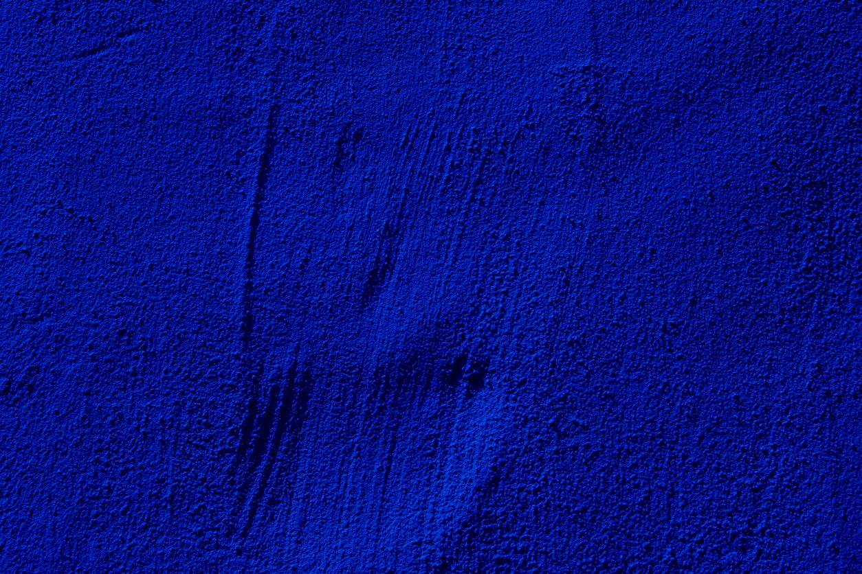
When you notice this specific shade of blue, you’ll see it everywhere. It’s on the walls at your trendiest local coffee spot. It’s the accent shade inside the Instagrammed living rooms of that influencer you follow. It’s in the logo for your friend’s new creative consultancy startup.
This is Gen Z blue, a variation of the saturated cobalt known as International Klein Blue (IKB), which has swiftly become the latest signifier of cool. Experts say that people are drawn to these trendy blue tones, not just because of fashion, but because it has a calming effect in times of economic uncertainty and political volatility.
In the past decade, the mainstream has largely been devoid of color as millennial gray and beige — AKA greige — came to dominate the social media algorithm and made everyone’s homes look the same. What was termed the “International Airbnb Style” saw gray walls become a global signifier of generic “good taste,” paired with a charcoal sofa, neutral kitchen cabinets and a fluffy silver carpet to match.
“We’re emerging from this really monochromatic period,” says Amy Kunst, a Sacramento-based interior designer. “And people really want to see more color.”
The Yves Klein shade of blue — first mixed by the French artist Yves Klein in 1956 and patented in 1960 — is increasingly being used to inject vivacity into interiors, and Kunst says it works because it is “sophisticated yet relaxed.” “There’s something about this color that really grounds a space,” she says. “It’s interesting, a little unexpected.”
Today, the color is favored by major retailers.
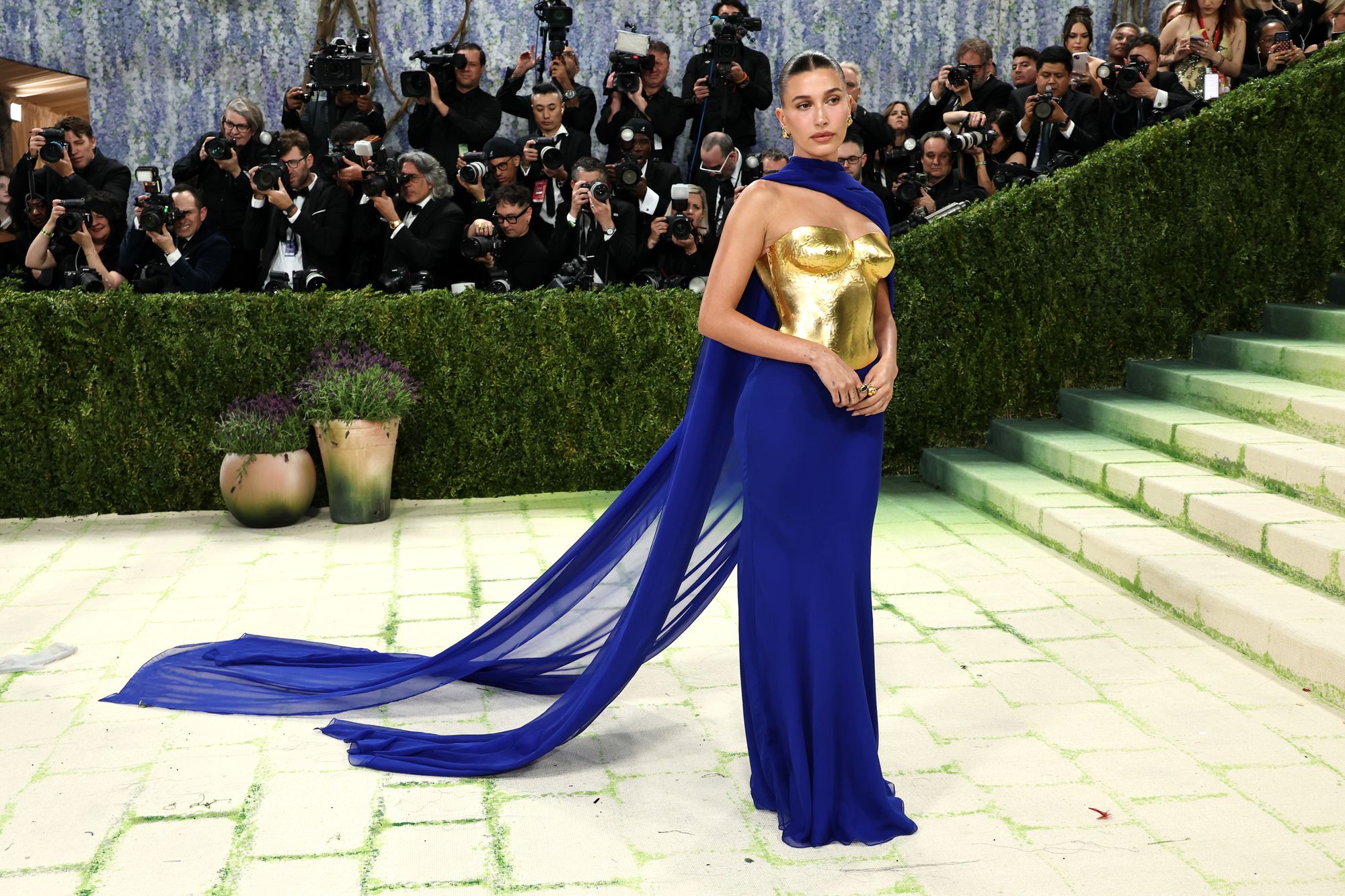
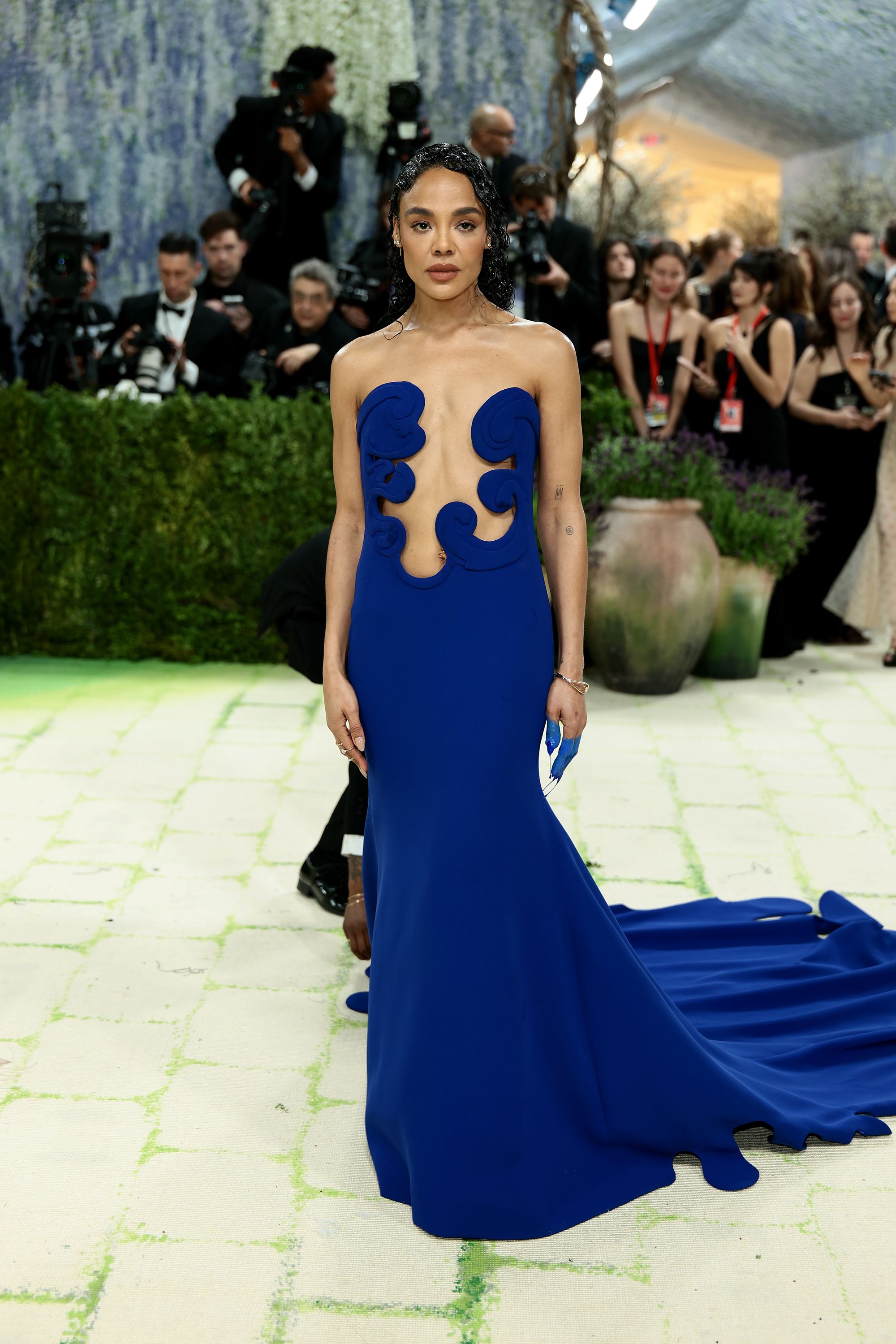
Just last week, Swedish homewares brand IKEA released its latest trending product, a floor lamp in cobalt, soon to be a staple in the living rooms of millennials everywhere. In fashion, the shade has also been paraded down the Spring/Summer 2026 runways for designers including Mugler, Valentino, and Isabel Marant, while Vogue named Yves Klein blue the “winner of the night” at the 2026 Met Gala, where the shade was worn by Hailey Bieber (in custom Saint Laurent) and Tessa Thompson (wearing a silk crepe gown from Valentino). In New York City alone, the velvety, intense ultramarine blue has become ubiquitous across the food scene, too. It is painted on the exterior of the buzzy small plates restaurant Margot in Fort Greene, Brooklyn. It’s also at Badaboom, a natural wine and rotisserie chicken joint in the trendy neighborhood Bedford-Stuyvesant, and glows in neon above the viral Manhattan pizzeria Ceres, which uses the shade in its logo and on its takeaway boxes.
The shade follows in the footsteps of millennial pink, the dusty blush-salmon hue that became the defining aesthetic of the mid-2010s, embraced by designers, beauty brands and social media startups alike. Suddenly, restaurants and bars changed their decor to this shade of candy floss pink, while Emily Weiss’s cult beauty brand Glossier designed its whole brand aesthetic around it.
In recent years, style trends — in the home and in the fashion world — have been less inspiring. From the late aughts, gray began to displace bright whites and creams as the preferred palette for interiors, ushering in the era of millennial grey. In 2011, Kim Kardashian famously threw out her vibrant wardrobe to become the monochrome muse of the past decade, influencing fashion, beauty and even homes. She designed her Los Angeles mansion almost exclusively in ecru and each festive season, she famously decorates her home with plain snow-covered Christmas trees.
The embrace of Yves Klein Blue, on the other hand, captures a totally different mood. Molly West Coe, a personal stylist to guests at the Four Seasons Hotel New York, says that the radiant cobalt is everywhere because it’s an accessible statement color. “It’s bold and luminous and sends a message. Color has a way of conveying a message you want to send to the world, and this one says a lot…. It’s a rich color that exudes confidence.”
Coe says the embrace of the color could represent an evolution of the quiet luxury trend, sometimes called the “old money aesthetic,” which is about replacing flashy logos or ostentacious garments with high-quality, neutral and minimalist clothing. “Quiet luxury has definitely moved us away from obvious logos and into pieces that feel timeless, and this cobalt blue feels like a really chic way to add personality without going over the top,” she adds. “It stands out, but still feels classic and refined.” If Coe were styling a client in a Yves Klein blue, she would opt for an evening gown in the shade. “I’d also love to see a beautiful heel in this color, or if you want to highlight it on a smaller scale, it makes a fun, lower-stakes nail color,” she says.
In the art world, too, Yves Klein blue is having a moment. In its latest trend report, Artsy, the world’s leading online marketplace for modern and contemporary art, identified that searches for “cobalt” had risen 131 percent year over year, while purchases tagged “bright and vivid colors” increased 22 percent over the same period.
Artsy’s Art Market Editor, Arun Kakar, believes people are drawn in by the calming connotations of blue, at a time of economic and political upheaval. “Blue has long been associated with tranquility by psychologists. There is a connection between economic uncertainty, political volatility and rapid changes that makes that emotional pull especially powerful,” he says.
“Cobalt is a color that has a vivid, emotional intensity,” says Kakar. “It commands real attention while still giving off a grounded atmosphere, which is quite a rare combination.”
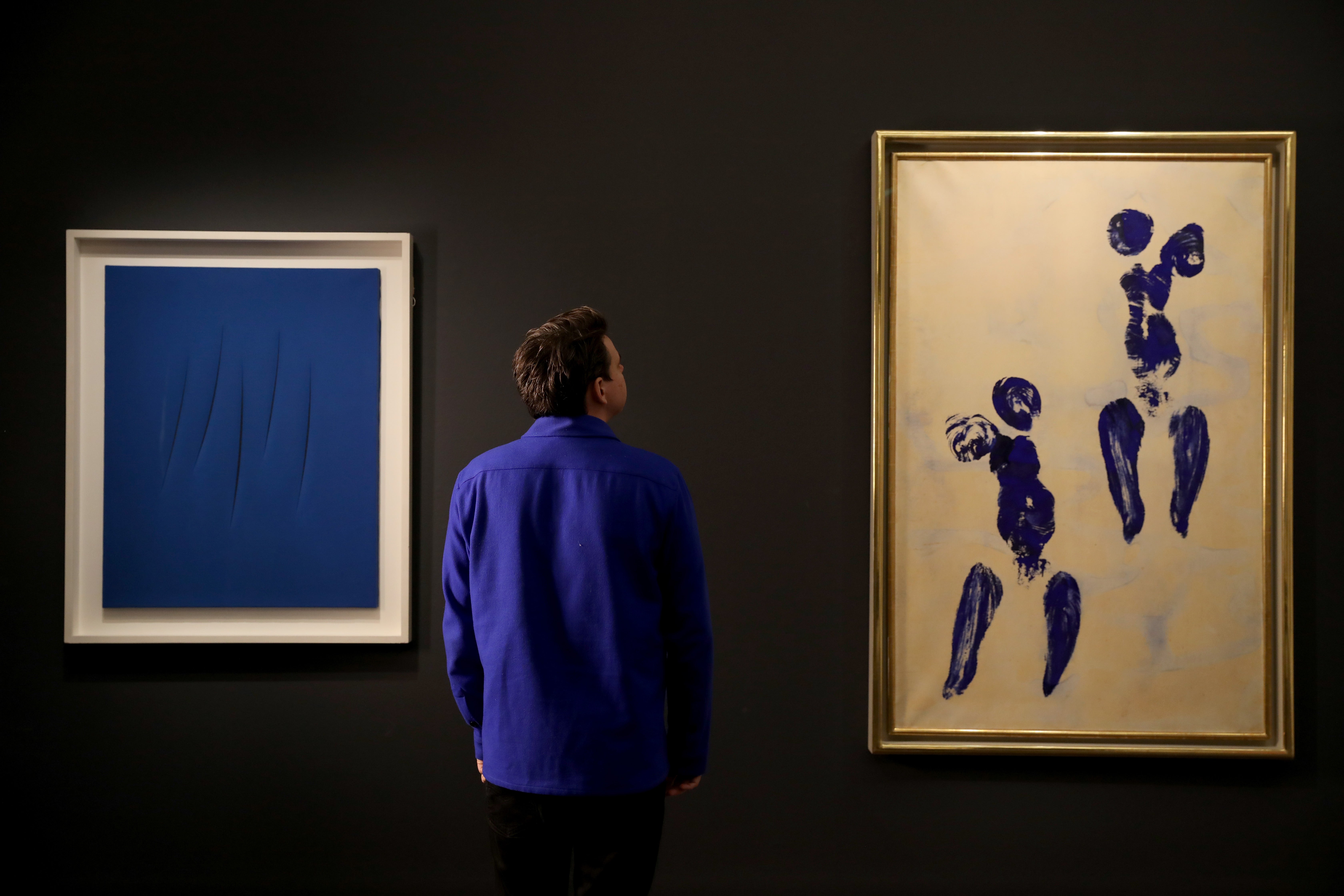
In October, Yves Klein’s California (IKB 71) from 1961 — the artist’s largest painting, measuring 77 x 166 inches and entirely covered in his signature luminous pigment — achieved a record result at Christie’s Paris in October, selling for €18.37 million ($21.34 million), making it the highest price paid for a Klein painting in France at auction. “That really reinforced a sense of cobalt and its art historical prestige,” says Kakar. “In a year where we are seeing overstimulation and instability, buyers are gravitating towards art that offers emotional grounding and that sense of escape.”
The color’s history runs deep. For centuries, blue has been associated with prestige, power and spirituality. From the 12th century onwards, artists increasingly depicted the Virgin Mary draped in blue robes, a reflection of the pigment’s value and significance. Before the 19th century, ultramarine — produced from the semi-precious stone lapis lazuli — was so expensive that an ounce of the pigment could cost as much as an ounce of gold.
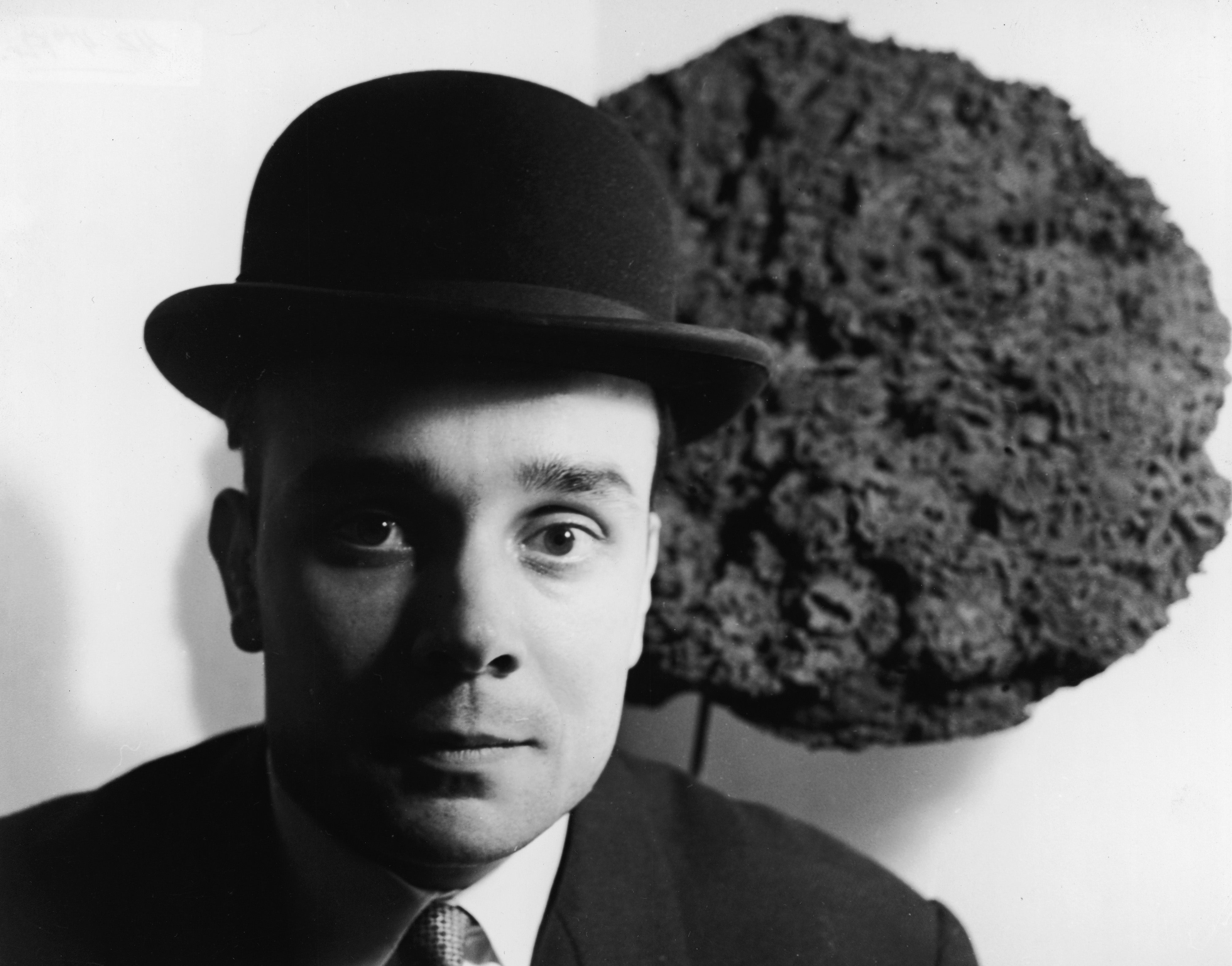
Then Klein came along — the French mad scientist of the post-war art world — who made his namesake color by mixing a pigment called ultramarine with synthetic resin. Born in Nice in 1928, Klein developed International Klein Blue in collaboration with the Parisian paint supplier Edouard Adam and a chemist, after finding inspiration in the cloudless blue skies of the French Riviera. He created a secretive formula for the paint so that it wouldn’t lose any vibrancy or shine. In January 1957, he presented “Proposte monocrome, epoca blu” at the Apollinaire Gallery in Milan — a display of 11 identical canvases, each coated in the ultramarine pigment that would become his trademark shade. Klein did not patent the color itself — under French law, a color cannot be owned — but rather the technique to make it. After Klein died in 1962, artists worked tirelessly attempting to replicate the formula. British artist Stuart Semple spent a decade trying to match it — through endless swatches and tests using a spectrometer — to create what’s known as “Easy Klein”.
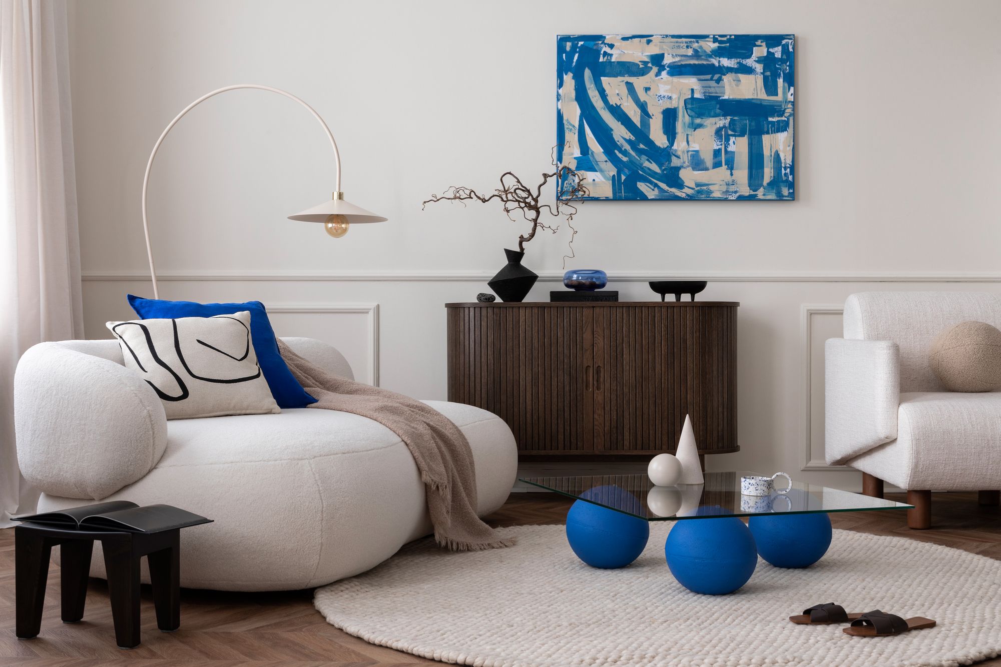
If you want to embrace the Gen Z blue in your home, Kunst wouldn’t suggest painting all of your walls cobalt blue, but instead focusing on small accents, like the inside of a bookcase. “It creates interest and depth, and then you layer other things in front of it as you’re styling the bookcase,” she says. “The color is visible, but it’s not front and center.” She says matching the shade with a throw blanket or cushion won’t overpower the room but add vibrancy. “It doesn’t seem overpowering and yet it creates different interest points in the room.”
Kunst thinks the trend will last if the color is used sparingly. “Any time when something is just very in your face, it gets old pretty quickly,” she says. “And so when I design, I try to create interiors that are going to be adaptable to trends.”
Trendproofing your home and wardrobe is definitely wise. Soon, those cobalt pizza boxes, coffee cups and floor lamps could turn green, or orange, or red. Whatever color is next, let’s just be grateful that the days of ecru and greige are behind us.