
How the ‘live, laugh, love’ font became totally inescapable
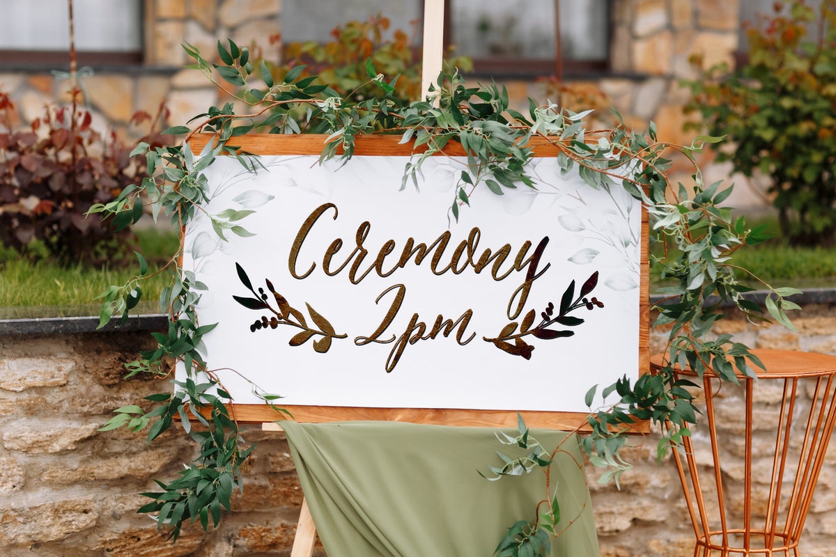
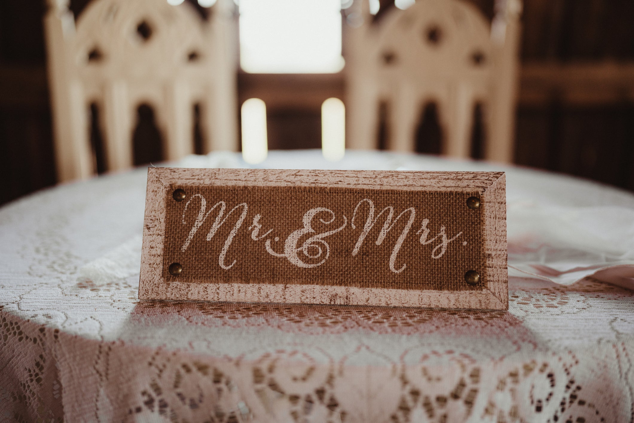
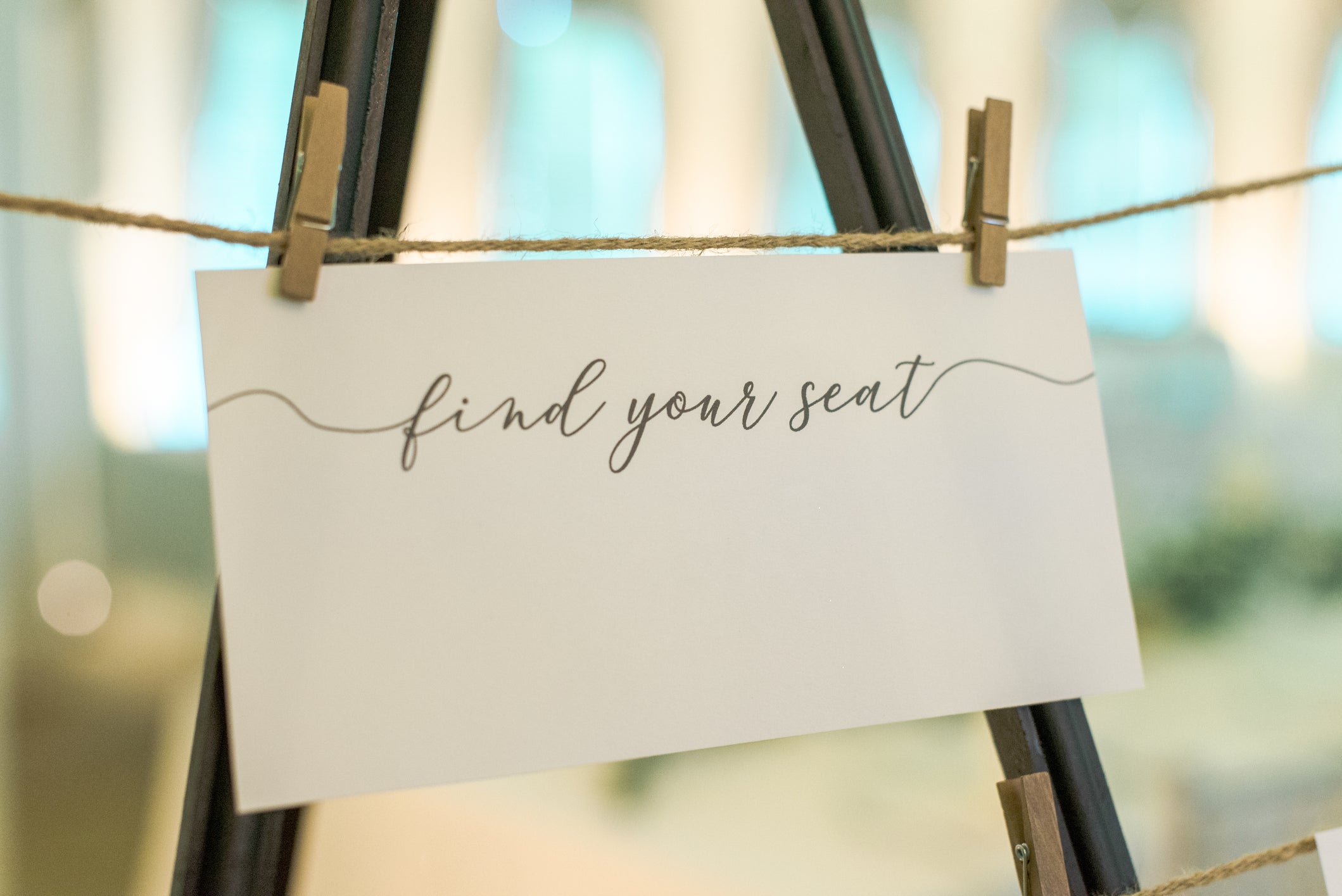
Personalised prosecco cups for a hen party, resplendent in rose gold. A wedding seating chart that blithely informs you that you’ve been placed next to the bride’s cousin’s weird best mate. Bits of “rustic” signage emblazoned with word-salad slogans screaming that it’s always “wine o’clock” somewhere. What unites all of these disparate objects? They’re all covered in the calligraphy-style scrawl of a certain ubiquitous typeface. It’s swishy, it’s swirly and it’s coming to a celebration near you.
Attended a baby shower or hen do at any point in the past decade? If so, you’ll probably be all too familiar with the sweeping brushstrokes of this particular style of font, which softens the contours of the most angular-looking consonants and adds a sense of homespun charm to the most passive-aggressive of instructions. “It’s that casual, handwritten-style script font,” says Vaishali Shah, founder of design agency Creative-ID and wedding stationers Anaya Cards. “Breezy, a little boho, and meant to feel personal, even if, ironically, it’s become the complete opposite of that.”
It has taken over wedding season, in particular, with all the speed and persistence of a particularly virulent form of Japanese knotweed, cropping up on invites, menus, name cards and banners. Just seeing the words “Happily Ever After” written in this script is enough to throw me into a cold, clammy panic. Did I book the correct regional Travelodge for the correct Bank Holiday weekend? Did I ever respond to that in-depth survey about fancy-dress options, sent round by a school friend’s maid of honour?
In the absence of any universal or official name, I’ve come to refer to this completely unavoidable typeface as part of “the ‘Live, Laugh, Love’ font family”, thanks to its steadfast presence on pieces of homeware imploring us to embrace this cheery-slash-cheesy approach to life. Eleanor Hancock, founder of Number 75 Design branding agency, reckons it is “the font equivalent of a ‘prosecco o’clock’ sign”. “It gives off big ‘blush pink balloon arch meets rustic trestle table energy’,” she adds.
When I ask Shah for her thoughts on the font, she paints a similar picture. We’ve all attended multiple versions of the same hen party. As a style, she adds, it is “friendly and easy to digest”, and she’s not surprised that it’s become so prevalent in the wedding industry, because those curly letters are a simple way to evoke a sense of “romance and softness”.
In more technical terms, it has been designed to reflect brush pen calligraphy, resulting in shapes that are less structured than traditional Copperplate or Spencerian calligraphy, explains Marie Boulanger, design lead at typeface specialists Monotype. “There is usually a fair amount of contrast” – that’s the variation in brushstroke thickness – and a “slight exaggeration of the curves and position of the letters”, she adds.
Hancock says that she first started to notice the style “creeping in around 2015-ish”, when “Pinterest was basically drowning in it”. And she has had first-hand experience of its popularity. A few years back, she had “a dirty little side hustle in the wedding and event world, creating bespoke signage, invites, menus, seating plans… you name it”.
What started as a small, fun project “quickly snowballed when people saw the work and started requesting that exact calligraphy style”. Inevitably, she’d end up writing out the same phrases over and over again: “Pop the Prosecco”, “Love, Laughter and Happily Ever After” and “Welcome to Our Forever” were among the greatest hits. Essentially, she confesses, “if it could be printed onto a Kraft card or painted onto a wooden pallet, I probably did it”.
In the age of social media, Hancock notes, a particular aesthetic can proliferate quickly. “Once something becomes algorithm-approved, it spreads fast,” she explains. “Before you know it, every bridesmaid is ordering signage in the same swirly script because ‘that’s just what you do’.”
And so we end up adopting these styles almost by osmosis, because they become synonymous with certain milestone events (it’s a bit like the grown-up version, I suppose, of when everyone thought Comic Sans was the height of cool for primary school projects). “The algorithms push the most popular content to everyone, and if you don’t really know what you’re even looking for, it can be very hard to form your own opinion,” agrees Boulanger. She’s getting married soon, and says that “doing research for my own wedding, with all sorts of inspiration tools, really opened my eyes to how blended everything felt”.
Before you know it, every bridesmaid is ordering signage in the same swirly script
Eleanor Hancock, Number 75 Design
It wasn’t until 2017 or so that the typeface reached a “tipping point”, Hancock says. “That was the year it left the cool corners of Etsy and elbowed its way onto every high street in the UK. Suddenly, it wasn’t just brides and event stylists using it. It was everywhere. Mugs, doormats, cushion covers, wall art, nail salons, prosecco flutes, eyebrow bars. If it had a surface, this font was slapped on it.” It proved particularly irresistible for fast homeware designers. Framed prints offering homespun wisdom and/or jokes about enjoying gin a bit too much? They had the perfect font for that.
Designers I speak to pinpoint the rise and rise of free graphics tools like Canva as a big factor in the font’s ubiquity. “I do think that the proliferation of people using Canva made design easier and therefore fonts like this [became] much more common,” says brand designer Emily Cecile, founder of Pretty Deep. She’s referring, of course, to the platform behind every other pastel-hued infographic you’ve scrolled past on Instagram.
Tools like this have created what graphic designer and art director Rachael Nichols calls a “template culture”, with Etsy sellers offering pre-set designs for customers to buy, download and tweak. “Design is a popular hustle to pick up as you can quickly generate digital products and host an online store without much time or cost commitment,” Nichols adds. And if they see that a certain font style or aesthetic is performing well, sellers will speedily roll out similar styles to meet the demand.
Customers, then, can add in their event details or mess around a little with the colour scheme, without having to do too much of the aesthetic legwork. The end product looks pretty serviceable, albeit eerily similar to every other paper invitation that’s landed in your letterbox recently. But given that organising a wedding, in particular, is an incredibly expensive endeavour – earlier this year, Hitched’s National Weddings Survey estimated the average cost to be £23,250 – it’s hardly surprising that the DIY approach is so popular. “A couple planning their wedding and trying to save money will be thrilled to type ‘wedding fonts’ and find hundreds of similar options for free,” says Boulanger.
This style, she adds, “has an exaggerated quality” and “is not focused on legibility”. How many times have you strained to read a pertinent detail on a wedding invite because it’s enveloped in brushstroke swirls? Essentially, then, it is “decorative, not functional”. And “that is how a lot of traditionally feminine qualities and activities are perceived and constructed” in our culture, she notes, often seen as “superfluous, perhaps even frivolous”. Of course, Boulanger adds, “I don’t think anybody is consciously making that stretch, but it has contributed to making this aesthetic ‘feminine’, and the algorithms did the rest.”
A couple planning their wedding and trying to save money will be thrilled to type ‘wedding fonts’ and find hundreds of similar options for free
Marie Boulanger, Monotype
Hancock agrees that the font “ticks every box marketers think women want”. She also reckons that it appeals because it still “feels personal”, even though we all know it’s mass-produced. “That faux-handwritten style gives the illusion that someone’s lovingly penned it just for you, even when it was actually downloaded from Etsy and printed on 40 tote bags,” she says. “It creates that emotional illusion of intimacy and care, which is what these events trade on.” And, she adds, “for group events like hen dos or baby showers, where you’ve got multiple personalities, ages and style preferences to consider, it’s the easy middle ground that nobody argues with. It won’t offend your nan or your boss.”
For her, and plenty of the designers I’ve canvassed, this type has long passed into the realms of cliche. “It’s not inherently bad, it served a purpose!” Hancock says. “It gave a generation of women a visual language to express celebration,” she concedes, but now “we’re ready for what’s next”. Shah, meanwhile, thinks we’ve fully hit “font fatigue”. Instead, she’s noticing “more brands, brides and hosts leaning into sleek, modern fonts” that are “still feminine, but more minimal and grown-up”.
Boulanger, though, is more wary of writing it off entirely. “This style is a cliche,” she says, “but it rose to prominence because it’s a very approachable calligraphy style, easy to replicate and it communicates a whimsical, handmade feel.” For a moment like a wedding, when, let’s face it, cliches are rife but also somehow lovely, “these connotations make sense and I think we’ll continue to see brush script fonts for a little while longer”. But she does have a caveat. “You won’t see any on my stationery, though.”
[title_words_as_hashtags